How CHECKS//MATES Built a Cannabis Brand From the Ground Up
How CHECKS//MATES Built a Cannabis Brand From the Ground Up
How CHECKS//MATES Built a Cannabis Brand From the Ground Up

The Idea: A New Brand Needs More Than a Good Product
Launching a cannabis brand in 2026 isn't just about having a great product. The market is crowded and the brands that win aren't just the ones with the best formula, they're the ones with the strongest identity. When the client came to CHECKS//MATES with a vision for a new cannabis brand built around a two-flavored vape, the goal was clear: build something that stands out from the moment someone lays eyes on it.
Who Is TANGO?
TANGO is a cannabis lifestyle brand built around a simple but brilliant premise — two flavors, one device. Their flagship product is a dual-flavor vape that delivers two distinct fruit-forward strains in a single unit. Beyond the vape line, TANGO has expanded into THC concentrates, with more product lines to follow.
The Brief: Build It All
This wasn't a rebrand. This wasn't a logo refresh. The client came to CHECKS//MATES with a product concept and needed everything else built around it — name, tagline, visual identity, packaging, brand guidelines, and a clear creative direction that could scale across multiple product lines. A Full brand buildout from scratch. That's exactly what we delivered.
The Creative: Where the Name and the Concept Came From
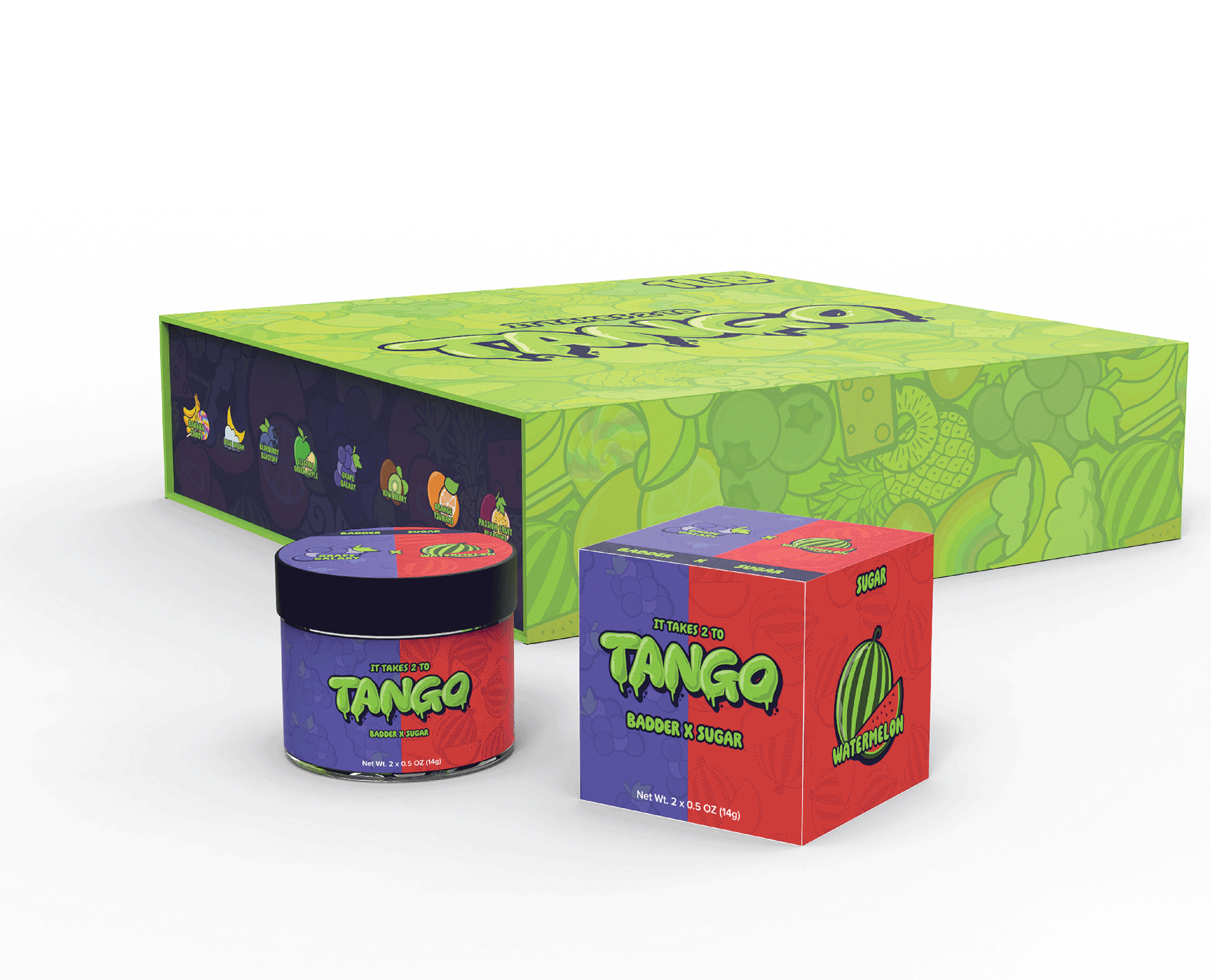
The name TANGO and the tagline "It Takes 2 to Tango" weren't happy accidents — they were the result of thinking deeply about what made the product unique. Two flavors. Two oils. One device. The tango as a dance requires two partners moving in sync, each complementing the other. The parallel was too perfect to ignore.
From there, every creative decision flowed from that core concept. The brand aesthetic went bold — neon bright colors and fruity icon elements that matched the fruity strains inside every device.
The split design on the packaging was the visual anchor of the whole identity — a deliberate design choice that immediately communicates the dual-flavor concept without a single word of explanation. A customer sees the packaging and already understands the product. That's what great brand design does.
The Execution: End-to-End
Concept is one thing. Getting it across the finish line — accurately, efficiently, and at a scale that actually works for a new brand's operations — is another.
CHECKS//MATES didn't just hand off files and call it done.
For every product across both the vape line and the THC concentrate range, the team customized product appearance within each manufacturer's design capabilities, always with an eye on what was most cost-effective for the client's real-world operations. That meant understanding minimum order quantities and designing packaging that could be flexible with them.
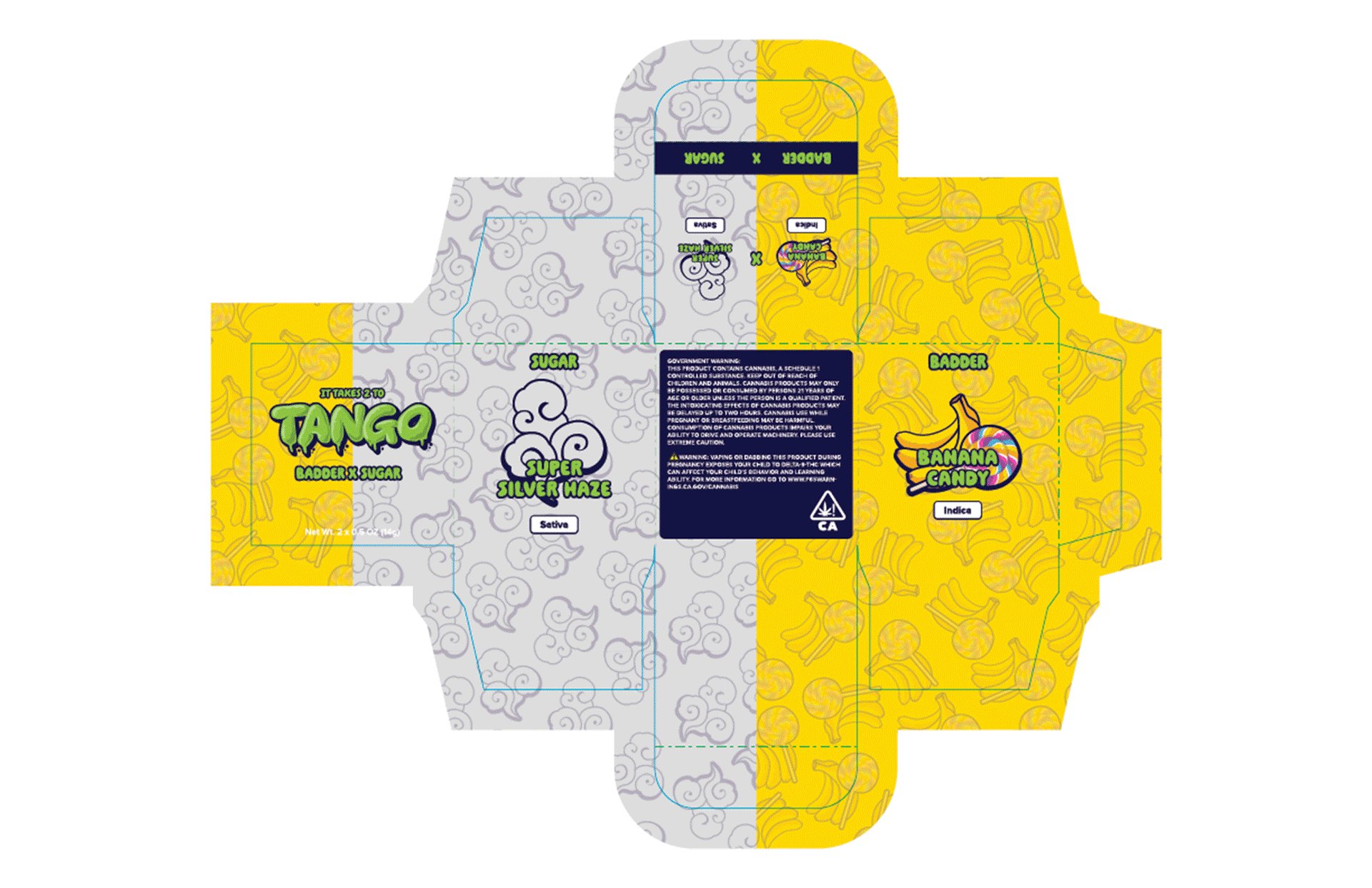
So rather than locking TANGO into rigid packaging for every strain variation, CHECKS//MATES built in a sticker system that allowed strain names to be updated without requiring a full packaging reprint every time a product line evolved. That's not just smart design. That's operational thinking that saves money on day one and protects the brand as it scales.
When it came time to get artwork to manufacturers, CHECKS//MATES managed that process directly — acting as a handheld concierge between the brand and production. Every file was reviewed with the kind of attention that determines whether a product looks premium or amateur on the shelf: aligned seams, correct artwork placement inside packaging, correct device-to-packaging linking. Without that level of oversight, the gap between what a design looks like on screen and what it looks like manufactured can be significant.
CHECKS//MATES closed that gap entirely, catching and correcting details before they became expensive mistakes.
The Deliverables: A Brand Ready to Scale
By the time everything was complete, TANGO had everything a new brand needs to go to market with confidence.
A full brand name and tagline rooted in the product's core concept.
A complete visual identity built around bold neon colors and fruity iconography.
Custom product design across the vape and concentrate lines.
Individual and bulk packaging designed and production-ready.
Artwork files delivered directly to manufacturers with final tweaks managed through to completion.
A comprehensive brand book — complete with all logo variations, brand colors, and 3D renders of every product — so that every future creative decision stays on brand, no matter who's making it.
The Bigger Picture: Why Brand Identity Is the First Investment
For a new cannabis brand, the temptation is to get the product right and figure out the brand later. TANGO is proof of why that's the wrong order of operations. The product was great from day one. But without a name that sticks, a concept that communicates, and packaging that demands attention on a crowded shelf — a great product alone doesn't move units.
What most agencies don't tell you is that brand identity and operational reality have to be designed together. A beautiful package that's financially impossible to produce at your minimum order quantity isn't a solution but rather a liability. A rigid packaging system that requires a full reprint every time your strain lineup changes isn't scalable — it's a bottleneck.
CHECKS//MATES built TANGO's identity with all of that in mind from the start, so that the brand Nick launched with is one he can actually run and grow without the design decisions coming back to bite him.
And when it came time to take that identity from concept to shelf, CHECKS//MATES stayed in it — managing manufacturer communication, catching production details that would have cost real money to fix after the fact, and making sure what got built was actually what was designed. That handheld concierge approach isn't just a service. It's the difference between a brand that looks like it belongs and one that looks like a first attempt.
TANGO was built to be remembered. Every element was designed to make someone stop, pick it up, and feel like they already get it before they've read a single word. That's what a brand is supposed to do — and that's what happens when identity and execution are treated in unison
Launching a new brand and don't know where to start? Let's build something worth remembering.
The Idea: A New Brand Needs More Than a Good Product
Launching a cannabis brand in 2026 isn't just about having a great product. The market is crowded and the brands that win aren't just the ones with the best formula, they're the ones with the strongest identity. When the client came to CHECKS//MATES with a vision for a new cannabis brand built around a two-flavored vape, the goal was clear: build something that stands out from the moment someone lays eyes on it.
Who Is TANGO?
TANGO is a cannabis lifestyle brand built around a simple but brilliant premise — two flavors, one device. Their flagship product is a dual-flavor vape that delivers two distinct fruit-forward strains in a single unit. Beyond the vape line, TANGO has expanded into THC concentrates, with more product lines to follow.
The Brief: Build It All
This wasn't a rebrand. This wasn't a logo refresh. The client came to CHECKS//MATES with a product concept and needed everything else built around it — name, tagline, visual identity, packaging, brand guidelines, and a clear creative direction that could scale across multiple product lines. A Full brand buildout from scratch. That's exactly what we delivered.
The Creative: Where the Name and the Concept Came From
The name TANGO and the tagline "It Takes 2 to Tango" weren't happy accidents — they were the result of thinking deeply about what made the product unique. Two flavors. Two oils. One device. The tango as a dance requires two partners moving in sync, each complementing the other. The parallel was too perfect to ignore.
From there, every creative decision flowed from that core concept. The brand aesthetic went bold — neon bright colors and fruity icon elements that matched the fruity strains inside every device.
The split design on the packaging was the visual anchor of the whole identity — a deliberate design choice that immediately communicates the dual-flavor concept without a single word of explanation. A customer sees the packaging and already understands the product. That's what great brand design does.
The Execution: End-to-End
Concept is one thing. Getting it across the finish line — accurately, efficiently, and at a scale that actually works for a new brand's operations — is another.
CHECKS//MATES didn't just hand off files and call it done.
For every product across both the vape line and the THC concentrate range, the team customized product appearance within each manufacturer's design capabilities, always with an eye on what was most cost-effective for the client's real-world operations. That meant understanding minimum order quantities and designing packaging that could be flexible with them.
So rather than locking TANGO into rigid packaging for every strain variation, CHECKS//MATES built in a sticker system that allowed strain names to be updated without requiring a full packaging reprint every time a product line evolved. That's not just smart design. That's operational thinking that saves money on day one and protects the brand as it scales.
When it came time to get artwork to manufacturers, CHECKS//MATES managed that process directly — acting as a handheld concierge between the brand and production. Every file was reviewed with the kind of attention that determines whether a product looks premium or amateur on the shelf: aligned seams, correct artwork placement inside packaging, correct device-to-packaging linking. Without that level of oversight, the gap between what a design looks like on screen and what it looks like manufactured can be significant.
CHECKS//MATES closed that gap entirely, catching and correcting details before they became expensive mistakes.
The Deliverables: A Brand Ready to Scale
By the time everything was complete, TANGO had everything a new brand needs to go to market with confidence.
A full brand name and tagline rooted in the product's core concept.
A complete visual identity built around bold neon colors and fruity iconography.
Custom product design across the vape and concentrate lines.
Individual and bulk packaging designed and production-ready.
Artwork files delivered directly to manufacturers with final tweaks managed through to completion.
A comprehensive brand book — complete with all logo variations, brand colors, and 3D renders of every product — so that every future creative decision stays on brand, no matter who's making it.
The Bigger Picture: Why Brand Identity Is the First Investment
For a new cannabis brand, the temptation is to get the product right and figure out the brand later. TANGO is proof of why that's the wrong order of operations. The product was great from day one. But without a name that sticks, a concept that communicates, and packaging that demands attention on a crowded shelf — a great product alone doesn't move units.
What most agencies don't tell you is that brand identity and operational reality have to be designed together. A beautiful package that's financially impossible to produce at your minimum order quantity isn't a solution but rather a liability. A rigid packaging system that requires a full reprint every time your strain lineup changes isn't scalable — it's a bottleneck.
CHECKS//MATES built TANGO's identity with all of that in mind from the start, so that the brand Nick launched with is one he can actually run and grow without the design decisions coming back to bite him.
And when it came time to take that identity from concept to shelf, CHECKS//MATES stayed in it — managing manufacturer communication, catching production details that would have cost real money to fix after the fact, and making sure what got built was actually what was designed. That handheld concierge approach isn't just a service. It's the difference between a brand that looks like it belongs and one that looks like a first attempt.
TANGO was built to be remembered. Every element was designed to make someone stop, pick it up, and feel like they already get it before they've read a single word. That's what a brand is supposed to do — and that's what happens when identity and execution are treated in unison
Launching a new brand and don't know where to start? Let's build something worth remembering.
Related Articles
How Stocks & Blonds Scaled Lead Gen with Framer and HubSpot

Read Article
How Stocks & Blonds Scaled Lead Gen with Framer and HubSpot
Read Article
How to Crush Your Black Friday & Cyber Monday Sales Goals (Even If You’re Behind)

Read Article
How to Crush Your Black Friday & Cyber Monday Sales Goals (Even If You’re Behind)
Read Article
Trade Show Marketing Strategy: Maximize ROI Before, During & After Events

Read Article
Trade Show Marketing Strategy: Maximize ROI Before, During & After Events
Read Article
How Stocks & Blonds Scaled Lead Gen with Framer and HubSpot
Read Article
How to Crush Your Black Friday & Cyber Monday Sales Goals (Even If You’re Behind)
Read Article
Trade Show Marketing Strategy: Maximize ROI Before, During & After Events
Read Article
Building Credibility for a Breakthrough Biotech Brand: The SeaChange Biochemistry Site Redesign

Read Article
Follow Us for More Marketing Insights
We share marketing tips, success stories, and deep-dive strategies across social media. Stay ahead of the competition and engage with us here:


Follow Us for More Marketing Insights
We share marketing tips, success stories, and deep-dive strategies across social media. Stay ahead of the competition and engage with us here:
Join Our Newsletter for Exclusive Insights & Case Studies
Stay ahead of the curve with deep-dive marketing strategies, case studies, and expert insights delivered straight to your inbox.


Copyright © 2025 CHECKS//MATES, INC
Copyright © 2025 CHECKS//MATES, INC
Copyright © 2025 CHECKS//MATES, INC
Copyright © 2025 CHECKS//MATES, INC